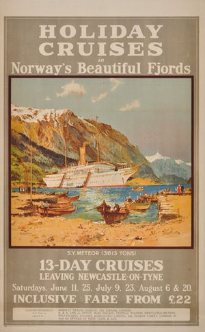
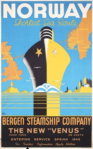
Seen together, these posters reveal how dramatically the visual language of Bergen Line advertising changed over the decades. The early B&N Line posters were often rich in information. Routes, sailing times, railway connections, fares and organised holidays all competed for the traveller's attention. Norway was attractive, but getting there quickly and conveniently was an equally important part of the message.
As tourism developed, the posters increasingly allowed the image to do the selling. Ships became powerful symbols in their own right, set against monumental mountains and deep blue fjords. The British artist Frank Henry Mason, one of the leading marine and railway poster artists of his generation, created an almost theatrical vision of a Bergen Line vessel surrounded by the Norwegian landscape. Dutch artist Jan Lavies took the idea even further, reducing the fjord to dramatic planes of rock, water and colour in his striking poster for cruises aboard Stella Polaris and Meteor.
BDS also drew on a new generation of Norwegian commercial artists. Finn Alfsen had studied in Britain and, while still a young artist, won a Shell advertising poster competition in London in 1928. After returning to Bergen he joined Bergens Annonce-Byrå, or BAB, as a designer and advertising consultant. His work for BDS reflects the increasingly bold graphic language of the 1930s. One of his BDS designs was reproduced in Commercial Art / Art and Industry in December 1934, where Alfsen was credited as the artist.
The ships themselves could also provide all the drama required. Posters for Vega and Venus transformed speed and modernity into graphic images: streamlined vessels crossing the North Sea, maps reduced to simple outlines and journey times made part of the design. A 1938 BAB poster proclaimed that Vega and Venus crossed the North Sea eight times a week, with the England route taking just eighteen hours.
After the Second World War, the emphasis shifted again. One of the outstanding artists employed by the Bergen Steamship Company was the British marine and poster artist Harry Hudson Rodmell (1896–1984). His 1948 Norway by Bergen Steamship Company poster depicts the rebuilt M/S Venus, which returned to service after the war. The image also appeared in the company's 1948 calendar.
In the later Bergen Line posters, however, the ship sometimes becomes secondary to the destination. Huge letters spelling NORWAY, stylised maps, waterfalls, mountains, traditional buildings and rural scenes present an instantly recognisable idea of the country. The journey is still there, but increasingly it is Norway itself that is being sold. Pat Nevin's colourful 1950s Norway by Bergen Line is a particularly clear example, combining a fjord, waterfall, wooden cabin, horse-drawn carriage and distant ship in a deliberately idyllic vision of the country.
The Madeira & Canaries for Sunshine poster provides an appropriate counterpoint. By this stage Bergen Line advertising was no longer confined to bringing foreign travellers to Norway. The same company that had promoted winter sports and the shortest sea route from Newcastle to Bergen could now tempt travellers with palm trees, flowers and sunshine far to the south.
What makes this group particularly special is that it is not assembled from reproductions or images gathered from different archives. Every poster illustrated in this article is, or has previously been, in the PosterTeam collection. Some have since found new homes with collectors, while others remain with PosterTeam today. Several are exceptionally rare, and bringing them together offers an unusual opportunity to see how one Norwegian shipping company presented itself – and Norway – through decades of changing graphic design.
From the detailed B&N Line advertisements of the early twentieth century to the bold modernism of the 1930s and the colourful destination posters of the post-war years, these works document much more than the history of a shipping company. They show how artists and designers from Norway and abroad helped shape an international image of Norway: accessible, adventurous, modern and spectacularly beautiful.
The Bergen Line carried the passengers. Its posters helped create the desire to travel.
Explore more: View all BDS – Bergenske Dampskibsselskab posters currently in the PosterTeam collection.